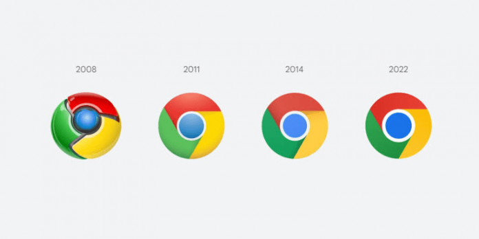
Google Chrome gets new logo after eight years
TECHDIGEST – For the first time in eight years, Chrome is making adjustments to its logo with minimal changes.
This was disclosed by Elvin Hu, a designer at Google, via a Twitter thread where he revealed the first look of the new Chrome logo.
“Some of you might have noticed a new icon in Chrome’s Canary update today. Yes! we’re refreshing Chrome’s brand icons for the first time in 8 years. The new icons will start to appear across your devices soon,” Hu said in the tweet.
Asides the different colour proportions, the big blue ball in the middle is now noticeably bigger and the various colour variations are designed to look more appealing on Windows, macOS and iOS.
Added to this, the logo now looks completely flat rather than having border shadows between each colour, which gives the logo a somewhat 3D look, although this varies across devices.
On ChromeOS, the logo will look more colourful to complement the other system icons, while on macOS, the logo will have a small shadow, making it appear as if it’s “popping out” of the dock. Meanwhile, the Windows 10 and 11 version has a more dramatic gradient so that it fits in with the style of other Windows icons.
“We created OS-specific customisations. We want the icons to feel recognisably Chrome, but also well crafted for each OS. For example, on Windows, the icons take on an obviously gradated look, appearing at home on Windows 10 and 11,” Hu added.
The new icon can be seen when using the Chrome Canary — the developer version of Chrome — and will be live for users across all devices with the release of Chrome 100 soon.
There are also some new icons for the beta and developer versions of the Chrome logo, with the most dramatic change being a blueprint-style icon for the beta app on iOS.
From 2008 until now, the Chrome logo has been getting gradually simpler. What started as a shiny, three-dimensional emblem has been squashed down into a 2D symbol.


